Home
Page
Editing
Services
Research
Fact Checking

Maps
Illustrations

Typesetting
Page Layout
Cover
Design
Web Site
Design
 
Typesetting - Choosing a font and type size


Typesetting for your book includes choosing a font or typestyle, type size, line leading, justification and hyphenation settings for the text of your book.

Typestyles should be chosen carefully for their readability. The first step in narrowing your font is choosing between a Serif or San-Serif font. Serif fonts have a fine line finishing off the main strokes at the top and bottom of a letter, while San-Serif fonts do not. Serif fonts are traditional for novels and books, while San-serf fonts are used more often in manuals and children's books. More artistic types of books like cookbooks, how-to books and historical books with large amounts of photos, are perfect for using fonts in imaginative and creative ways.

A few samples of Serif and San-Serif fonts.
 

The type size should be adjusted for readability. If your book will be read mostly by elderly people make the type size "large print" to accommodate your readers. A larger type sizes may add pages to the book but it will make it more enjoyable for the reader. We would be happy to help you determine what font and type size to use for your book by sending you samples of different fonts in various type sizes. These samples will also give you an approximate page count of the finished book.

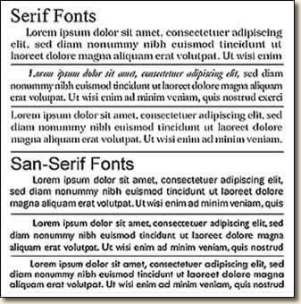
A good design will usually use no more than three fonts and should use consistent type sizes for headlines, subheads, body text and captions. The combination of fonts used throughout the book should compliment each other for a more pleasing overall design.


The design and layout of your book should reflect the subject of the book and style of your writing. The design and layout of your book will combine choices of fonts, illustrations and other elements placed on pages using a consistent layout design though out the book.
Consistency in the section pages,
chapter title pages and the text pages
will bring the design together.
 
Used to separate different sections of a book or when a book contains more than one book within a novel. These pages will always be on the right hand side of the open book to delineate that what follows is a new beginning point in the story. A stylized font, graphic elements and/or illustrations can be used to add style and distinction to these types of pages.
 
Chapter title pages are a break in the story and a chance for the reader to put down the book. The style and layout of your chapter title pages can be designed to draw the reader back into your story line. Chapter titles, drop capital letters or a font change of the first words or letters of the beginning paragraph can be used to add to the style of these pages. Unique illustrations for each chapter add a certain style and flavor to the book and make it easier for readers to find the place where they left off reading.
 
The layout of the text pages depends on the elements you want to include. The title of the book, author name, chapter name, chapter number and page number can all be included. Page numbers can be placed at either the top or bottom of the page where as typically the other information is placed at the top of the text column. Text size and formatting along with rules or simple design elements will help distinguish this information from the main body of the text.
 
Home Page Editing Services Research & Fact Checking

Maps & Illustrations

Typesetting & Page Layout Book Jacket & Cover Design Web Site Design
 
Call: 1-888-284-2654, Monday - Friday 9:00 a.m. - 5:00 p.m. (Central)
E-Mail:
info@westernediting.com


You may also want to visits

HelpPublish.com MagicGraphix.com
EditingWesterns.com EditingHistoricalFiction.com
© 2005, WesternEditing.com